
In 2015 we upgraded Lendesk's UI from stock Bootstrap to Material Design, which was the new hotness at the time.

It seemed like a good fit, however, as the app grew and more features were added, Material Design proved inadequate. The form inputs were too large and difficult to fill out non-sequentially. Also, at the time, the material design spec had no patterns for things like data tables, accordions or handling multiple creation actions.
Long story short, we were forced to roll a lot of patterns, experiment, and grow the UI over time, which led to a jumbled mess of conflicting patterns, duplicate components, and an awful information hierarchy. A lot of these issues were reflected in our codebase, which had our component library baked into our React front end.

It seemed like a good fit, however, as the app grew and more features were added, Material Design proved inadequate. The form inputs were too large and difficult to fill out non-sequentially. Also, at the time, the material design spec had no patterns for things like data tables, accordions or handling multiple creation actions.
In 2017 I led the effort to clean up the mess, still using Material Design as the base, consolidating components, patterns, and cleaning up a lot of the information architecture issues. I worked with our front-end devs to implement this as an external library. While this didn't solve some of the core problems with using Material Design in the first place, the idea was that this would be a first step and with everything cleaned up, we could go in and more easily update the designs of individual components into a new design system.

We launched the redesign just in time for a beta release for mortgage brokers in early 2019. This was the first time mortgage brokers actually used our product en masse. Previously, our main client group was payday lenders, which need very similar tools, but have very different processes. As the feedback rolled, it became pretty obvious we'd made some missteps. People complained about a lack of information density, needing to click into multiple views to find information. Along with these clicks were relatively long load times, a byproduct of complex calls in our API. It turned out brokers often edited applications out of sequence, which was made difficult by hiding forms inside of accordions. Of course, we also got plenty of feedback about Material Design that we already knew would be an issue.
At this point between our customer success, sales, and design teams, we had years worth of feedback and prospective client wish lists collected. It was a huge amount of information covering many parts of the app. Luckily, I've never been afraid of complexity, and, being responsible for many of those problems, I was determined to tackle them head on. At this point I'd been a product designer for almost 10 years and these were the kind of problems I was really good at solving.


However, I got thrown a curve ball. In 2019 our previous director left the company and I was promoted in his place. Suddenly, my job changed from solving the problem to figuring out how to lead my team to solve the problem.

How do I motivate and empower designers, each of whom are already at capacity with projects, to do more work on a design system that won't benefit their day-to-day work for a long time.

To motivate the team, I needed to get them excited about a vision of what this design system would become and give them a sense of ownership over the project. But none of that would be very valuable if I couldn't make sure they had the capacity to take on the additional work.
Capacity
Capacity for a long-term project like this will come at the expense of more immediate work. To make sure this could happen, I needed to get buy-in from stakeholders that could inject work into the design team: Product, Engineering, and the C-Suite. Product and Engineering were doubly important because PMs and Devs work with designers, which meant they would inevitably be pulled in to consult or support our efforts.
I had put in a lot of effort to build good relationships with the Director of Product and VP of Engineering, so I started with getting them on board. Product didn't take much convincing because that team wanted to address our long backlog of feedback just as much as I did. For Engineering, I explained how we could align a lot of these initiatives with much needed code refactors and removal of legacy systems that were costing a lot of overhead to maintain. With my peers in Product and Engineering were bought-in, we were able to work together to minimize impacts from shifts in business priorities from the C-Suite.


Ownership
The great thing about motivating designers is that, generally, we're all driven by a love of solving challenging problems. With three product designers on the team, I split the collected feedback into three broad, meaty categories for each to call their own. To really help bring the team together on this, I led the team through a branding exercise to help build that sense of ownership and buy-in. Here's the result:

Fix issues related to material components
Improve navigation, use of space, and information hierarchy


Increase the speed and efficiency of application intake
Creating a Shared Vision
Even though each product designer owned their part of the overall design system, creating a shared vision was important to keep everyone aligned and excited about the whole undertaking. To do this I involved the entire team in creating the vision, from the first conversation right through to deciding the direction we want to pursue. This did two things:
-
It allowed us to figure out a vision from a much larger collection of ideas
-
Seeing their ideas baked into the vision builds the team's buy-in
How did this work in reality? Here's what we did for Project Hippo:
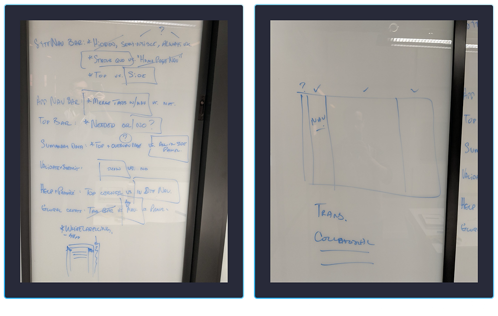
Our first brainstorming session happened after work on a Friday, over drinks. I quickly sketched out a thought I'd had on a meeting room window. Pretty soon the entire design team had gathered around, expo markers in hand, to riff on each other's ideas.

There were too many competing thoughts to figure out a solution on a whiteboard, so I assigned everyone to come up with their own proposal independently and we would critique each to figure out how to proceed. The proposal was limited to the mortgage application section of the app, which is the most complex section, and one in which users will spend most of their time, We got back together the following week with three people, including myself, having proposals ready to go:


I led the team through a critique of each proposal, listing out the pros and cons of each.

After that, we outlined all the conflicting ideas, discussed each and came to a rational consensus as a team. This resulted in a clear, if admittedly simple looking mockup which represented the direction we wanted to go.
Mel, the designer assigned to the project, then took this away and came up with an initial set of mocks of the consolidated idea, as well as how that could stretch to other parts of the app.

Iteration
That shared vision was just a starting point. From there, each designer ran their project independently, though with a tight feedback loop to the rest of the team. At first we did this very ad-hoc; each designer showed their progress when they felt it was ready. However, to keep people from spinning their wheels too much, I implemented a weekly design review for people to show their work before it was ready. This allowed faster iteration and the design team did a great job of focusing on the specific topics that needed to be reviewed.
We also had a long-standing weekly workshop to discuss any high level decisions that needed to be made. This covered topics like which font scale, vertical rhythm, grid systems, copy, and colour usage. These might seem like minor decisions, but they're so fundamental that it's critical to get everyone aligned on them or it throws the whole design system off.
As the individual projects progressed, we also figured out what minimum subset of form fields was required for brokers to submit to lenders, helping Project Cheetah make the application more efficient...

...how to use the checkout area in Project Hippo to promote actions and guide brokers through our application workflow...


...and how to adapt our new components for mobile (lovingly dubbed "Fat Panther").

Execution
Brokers are often trying to push through last minute deals with a tight turnaround; dealing with that kind of stress, the last thing they want is to adapt to a sudden change in UI. To handle this, we talked to our users. In some cases, like Project Panther, it made sense to change everything in one release. In others, like Project Hippo, we created a gradual, phased roll-out plan. This way brokers could get used to the navigational changes gradually.


Working in a tight feedback loop, the design team was able to rally around a cohesive vision for the product.

Updated overview page, including clearer application progress tracker. Key data brokers need is now available in the checkout on the right, along with a more prominent submit CTA.

All data points needed to submit an application are now editable on one page; the full forms are still preserved in a modal.

Kanban-style view of all applications at various stages of completion; this was also never built.
Updated overview page, including clearer application progress tracker. Key data brokers need is now available in the checkout on the right, along with a more prominent submit CTA.
Client reception was very positive. Some of the biggest wins were:
-
We were able to address a lot of concerns brokers had around information density, use of space, and ease of filling out the application.
-
The collapsible menu sections that were implemented as part of project hippo drastically improved readability on smaller screens.
-
The additional space let us solve a problem we hadn't initially planned to tackle: validation. We validate all the application data before brokers can submit to a lender to ensure completeness and accuracy. Previously, this function lived on a separate submission page, forcing users to navigate back and forth if they needed to fix any errors. With Project Hippo, we were able to pull that CTA into a space visible on every page, allowing users to continuously validate from anywhere, fixing errors on the go.
-
By changing from accordions to editable tables and open forms we managed to cut down application input times for first time users by about 36%, on average. This increase was even larger for our lender clients who were manually inputting applications they received via email.